
Figures marked "CSIRO", are copyright CSIRO, but please feel free to use them, conditional on the figures not being altered, and their source being acknowledged, and with a link to this site where possible. All other figures are copyright. Please do not copy without the owner's permission.
|
Sea-level projectionsObservations vs Projections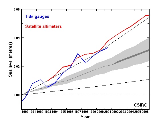
Recent observations show the observed sea levels from tide gauges (blue) and satellites (red) are tracking near the upper bound (black line) of the IPCC 2001 projections (grey shading and black lines) since the start of the projections in 1990 (Rahmstorf et al. 2007). This upper limit leads to a global-averaged sea-level rise by 2100 of 88 cm compared to 1990 values. These observations do not necessarily indicate that sea level will continue to track this upper limit - it may diverge above or below this upper limit. However, the ice sheet uncertainties referred to above are essentially one-sided – i.e. they could lead to a significantly larger sea-level rise than current projections but are unlikely to lead to a significantly smaller rise. Note also that greenhouse gas emissions are now tracking just above the highest of the SRES emission scenarios used in calculating these projections (GCP_CarbonBudget 2007, Raupach et al. 2007; Canadell et al. 2007). References |