

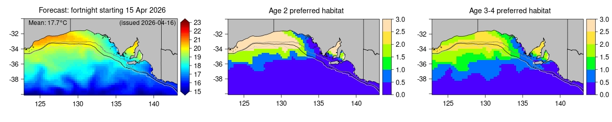
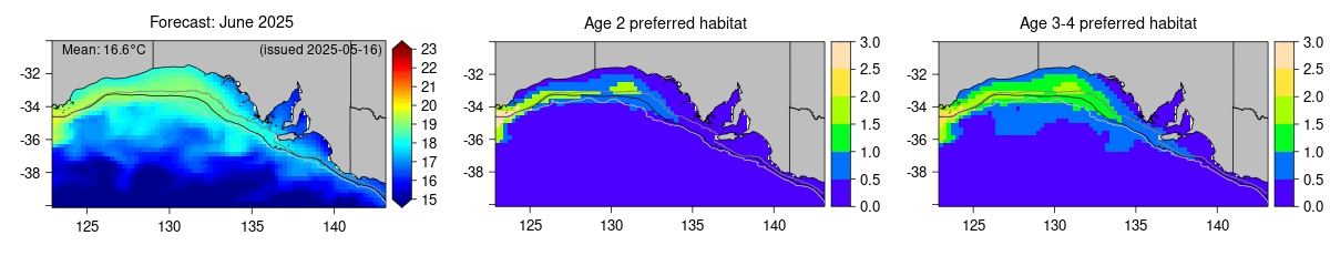
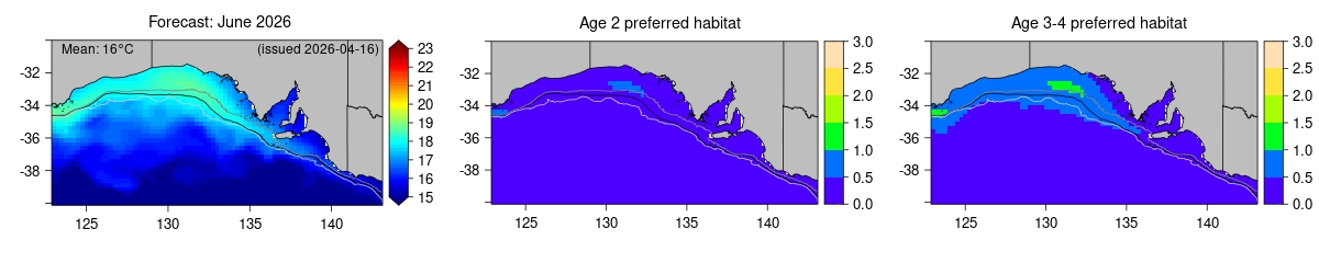
Habitat preference forecasts
Left: Forecasts of average SST (°C) for the next 2 fortnights through to 2 months in future (see SST forecasts) and issued on the date specified in the upper right corner of the figure. The dark grey, black and light grey lines indicate the 100 m, 200 m and 1000 m depth contours.
Centre & Right: Maps showing corresponding areas of preferred habitat for age 2 fish and age 3-4 fish, respectively (see Estimating habitat preferences). Values > 1 indicate more preferred habitat, values < 1 indicate less preferred habitat.
When interpretting these figures, it is important to consider the accuracy of the SST forecasts on which they are based, which can be assessed by clicking on the 'Forecast skill' tab below each figure.
Habitat forecast: first fortnight
 Full-size image
Forecast skill
Full-size image
Forecast skill
Habitat forecast: second fortnight
 Full-size image
Forecast skill
Full-size image
Forecast skill
Habitat forecast: first month
 Full-size image
Forecast skill
Full-size image
Forecast skill
Habitat forecast: second month
 Full-size image
Forecast skill
Full-size image
Forecast skill