|
GODAE Inter-comparisons
in the south western Pacific Ocean
Peter R. Oke, Gary B. Brassington, James Cummings,
Marie Drevillon, Fabrice
Hernandez and Matthew Martin
Introduction
● Quantitative Assessment ● Qualitative
Assessment
Introduction
The goals of this study are to:
-
to
understand when, where and why different systems perform well, or poorly, so
that all systems can be improved in terms of their modelling and data
assimilation techniques.
-
determine whether some ocean
processes are consistently well/poorly reproduced by all systems and to
understand why.
Data
Comparisons are made
between model products provided under the GODAE Inter-comparison activity.
The important elements of the four operational ocean forecast systems considered
here are summarised in Table 1. Of these systems, Bluelink
and HYCOM are eddy-resolving, and FOAM and Mercator are eddy permitting. Bluelink, FOAM and Mercator all use z-level models, while
HYCOM is characterised by a hybrid, adaptive vertical grid. Both FOAM and
Mercator use the same model code and grid. All systems use different NWP flux
products. The NWP fluxes for Bluelink, FOAM and
HYCOM represent diurnal variability, while Mercator uses daily averaged
fluxes.
Table 1: Model
characteristics (in progress).
|
|
OMAPS-hc
|
OMAPS-fc |
BRAN |
UKMet
|
HYCOM
|
Mercator
|
|
Model code
|
MOM4
|
MOM4
|
MOM4
|
NEMO
|
HYCOM
|
NEMO
|
|
Horizontal grid
|
1/10o
|
1/10o
|
1/10o
|
1/4o
|
1/12o
|
1/4o
|
|
Vertical grid
|
47 levels
|
47 levels
|
47 levels
|
50 levels
|
32 hybrid
|
50 levels
|
|
NWP fluxes
|
GASP 3-hr
|
GASP 3-hr
|
ECMWF 3-hr
|
UKMO 6-hr
|
NOGAPS 3-hr
|
ECMWF 1-d
|
|
Forecast range
|
7-d
|
7-d
|
7-d
|
5-d
|
7-d
|
7-d (14-d)
|
|
updating
|
twice weekly
|
twice weekly
|
weekly
|
daily
|
daily
|
daily (weekly)
|
|
Hindcast
|
11-d
|
11-d
|
n/a
|
1-d
|
5-d
|
14-d
|
|
SST data |
des AMSR-E |
des AMSR-E |
a/d AMSR-E |
tba |
tba |
tba |
|
SLA data |
GTS atSLA |
GTS atSLA |
DM atSLA |
tba |
tba |
tba |
|
T/S data |
GTS Argo/XBT |
GTS Argo/XBT |
DM Argo |
tba |
tba |
tba |
All systems, except Bluelink, produce daily forecasts of at least 5-days.
Each system uses a hindcast period to spin the
model up prior to a forecast. FOAM uses a short hindcast
period of 1-day, while all other systems use a hindcast
period of at least 5-days.
Comparisons presented
here are based on:
Bluelink ReANalysis
– delayed mode quality controlled along-track altimeter data; NRT
AMSR-E data, NRT Argo data (no XBT data), NRT ECMWF surface fluxes, 7-d update cycle.
OMAPS-hc – 6-9 days behind real-time hindcasts using
OceanMAPS, the operational Bluelink forecast
system.
OMAPS-fc – 3-4 days real-time forecasts using
OceanMAPS, the operational Bluelink forecast
system.
UKMet – Nowcasts
from the operational system … correct?
HYCOM – 5-day behind real-time analyses … correct?
Mercator –
7-14-day behind real-time hindcasts using Mercator PSY3 system.
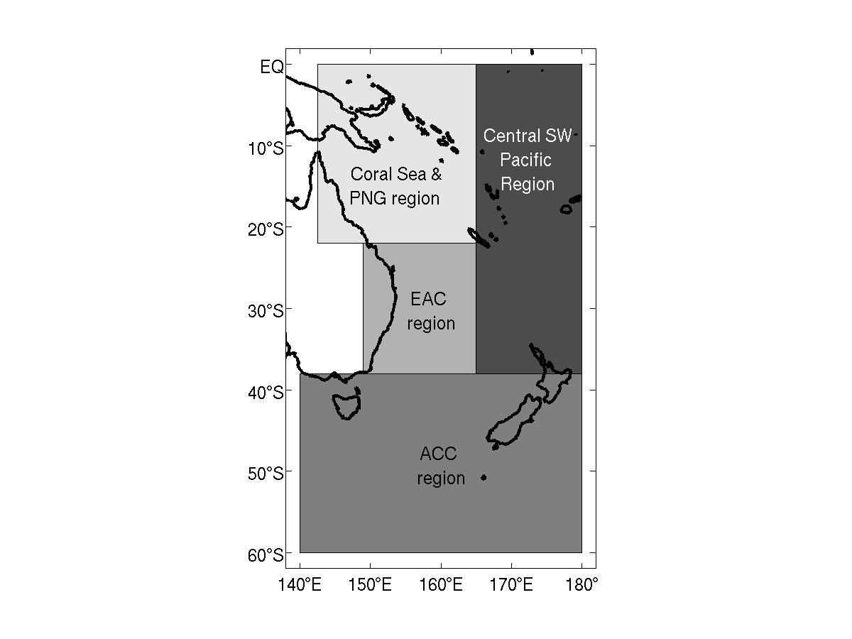
Quantitative Assessment
Comparisons are
presented for four regions in the south western Pacific
Ocean:
-
EAC region (149-165E, 38S-22S)
-
Coral Sea and PNG region (142.5-165E, 22S-EQ)
-
ACC region (140-180E, 60S-38S)
-
Central south Pacific region (165-180E,
38S-EQ).
These regions are
chosen as a subset of the South-Pacific GODAE Inter-comparison region to
isolate the different dynamical regimes of the South-Western Pacific Ocean
circulation.
Click here for image (~80K)
Surface Drifting Buoys
SST
|
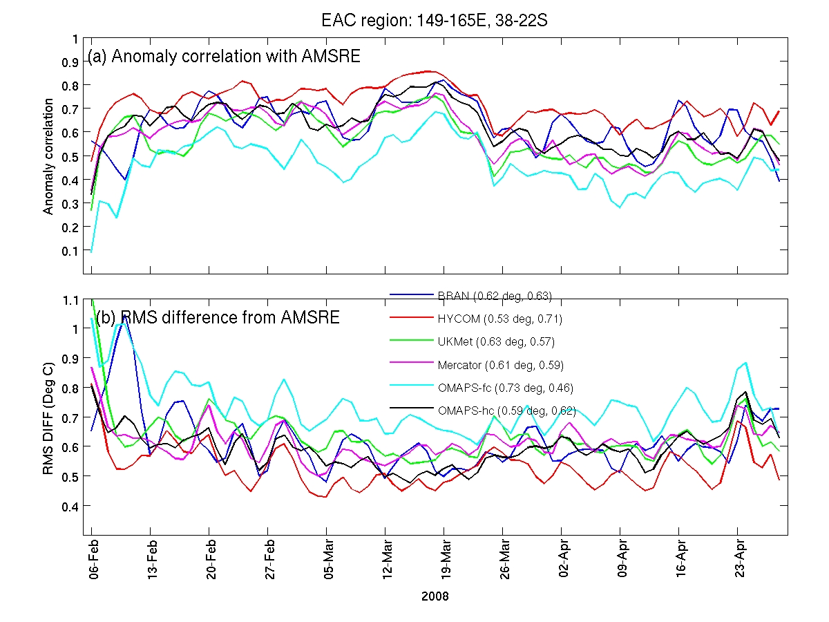
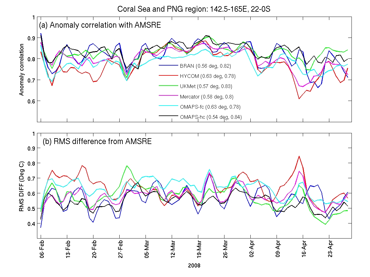
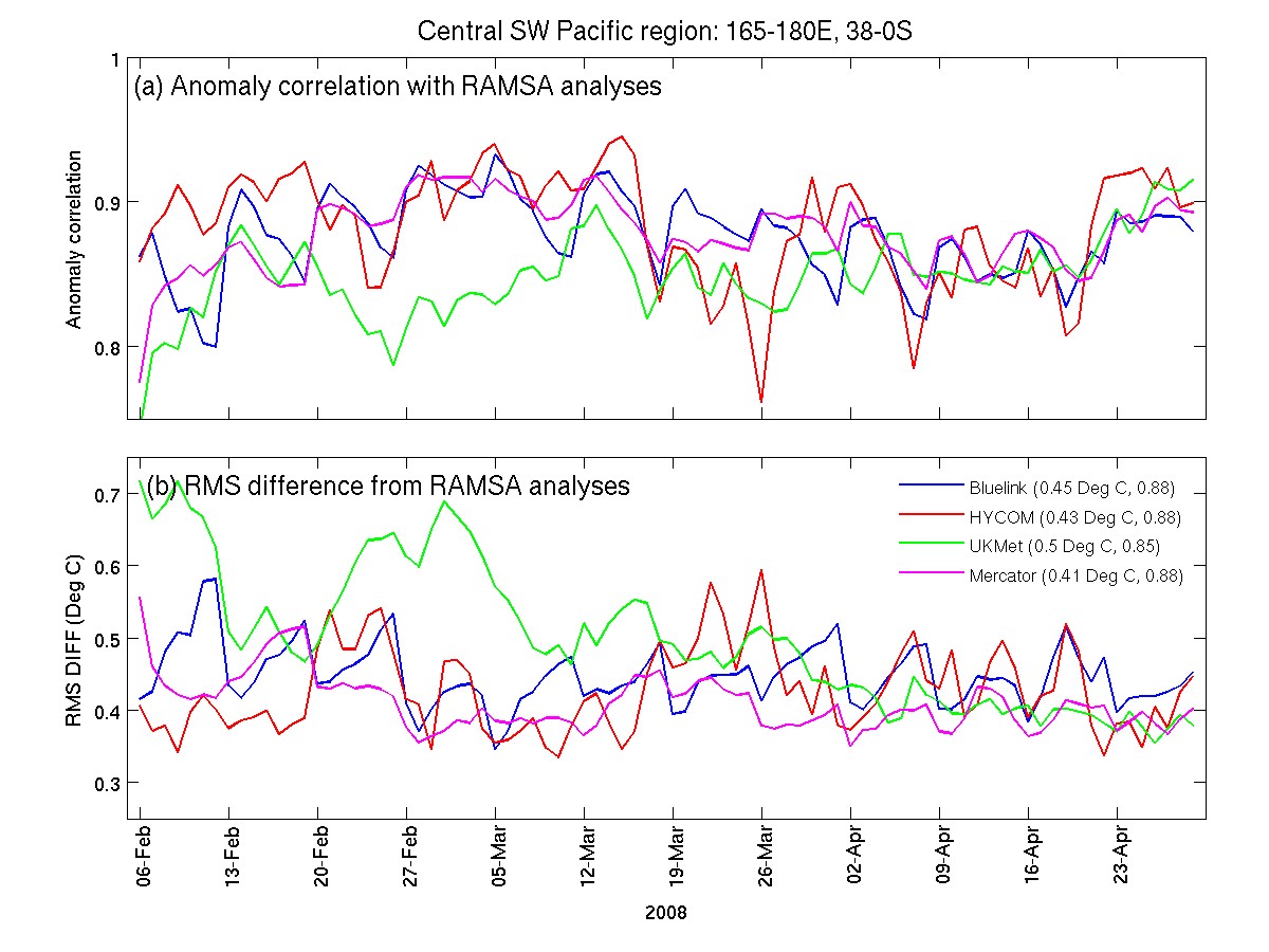
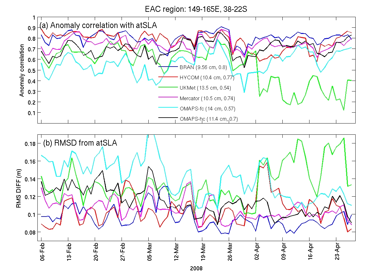
EAC Region: Time series of (a) anomaly correlation and (b) RMS difference
between modelled SST and the Regional Australian Muliti-Sensor
SST Analysis (RAMSSA) fields.
The statistics in
the legend show the time-mean RMS difference and anomaly correlation.
We use the RAMSSA
1/12 degree resolution SST fields produced operationally at the BoM as described by Beggs
(2007; BMRC Research Report; ~3.7M). RAMSSA is
a GHRSST L4 product that produces a foundation SST estimate by combining
AVHRR, AMSR-E, AATSR, and in situ buoy data using OI.
Click here for image (~200K)
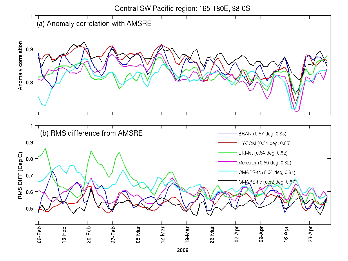
Time series as
above, except compared to AMSR-E SST observations (both ascending and
descending).
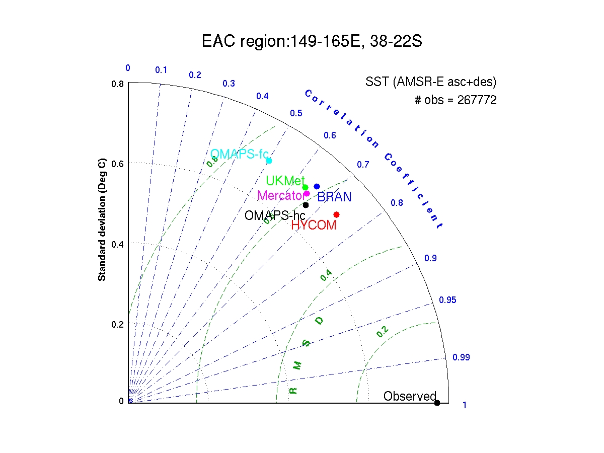
Click here for image (~400K)
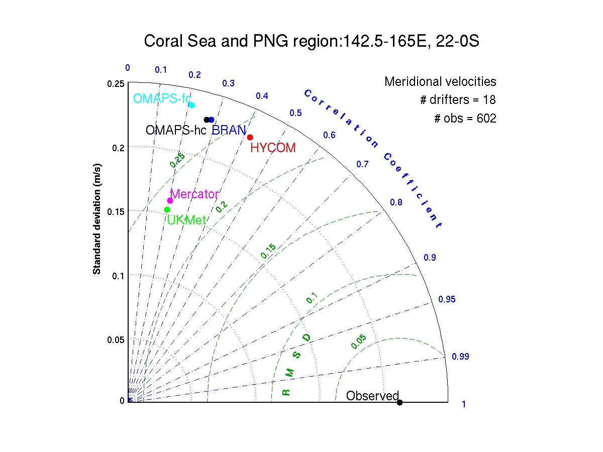
Taylor diagram (see Taylor 2001; JGR-Atmos) showing comparisons between AMSRE and modelled
SST.
Click here for image (~280K)
|
|
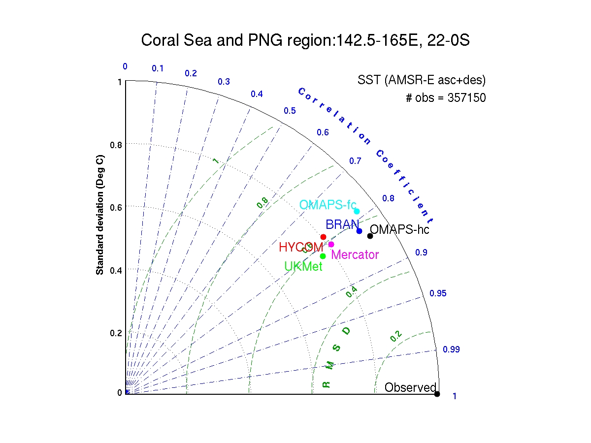
Coral Sea and PNG region: as above
Click here for image (~200K)
Time series as
above, except compared to AMSR-E SST observations (both ascending and
descending).
Click here for image (~400K)
Taylor Diagram for
comparison with AMSRE SST
Click here for image (~280K)
|
|
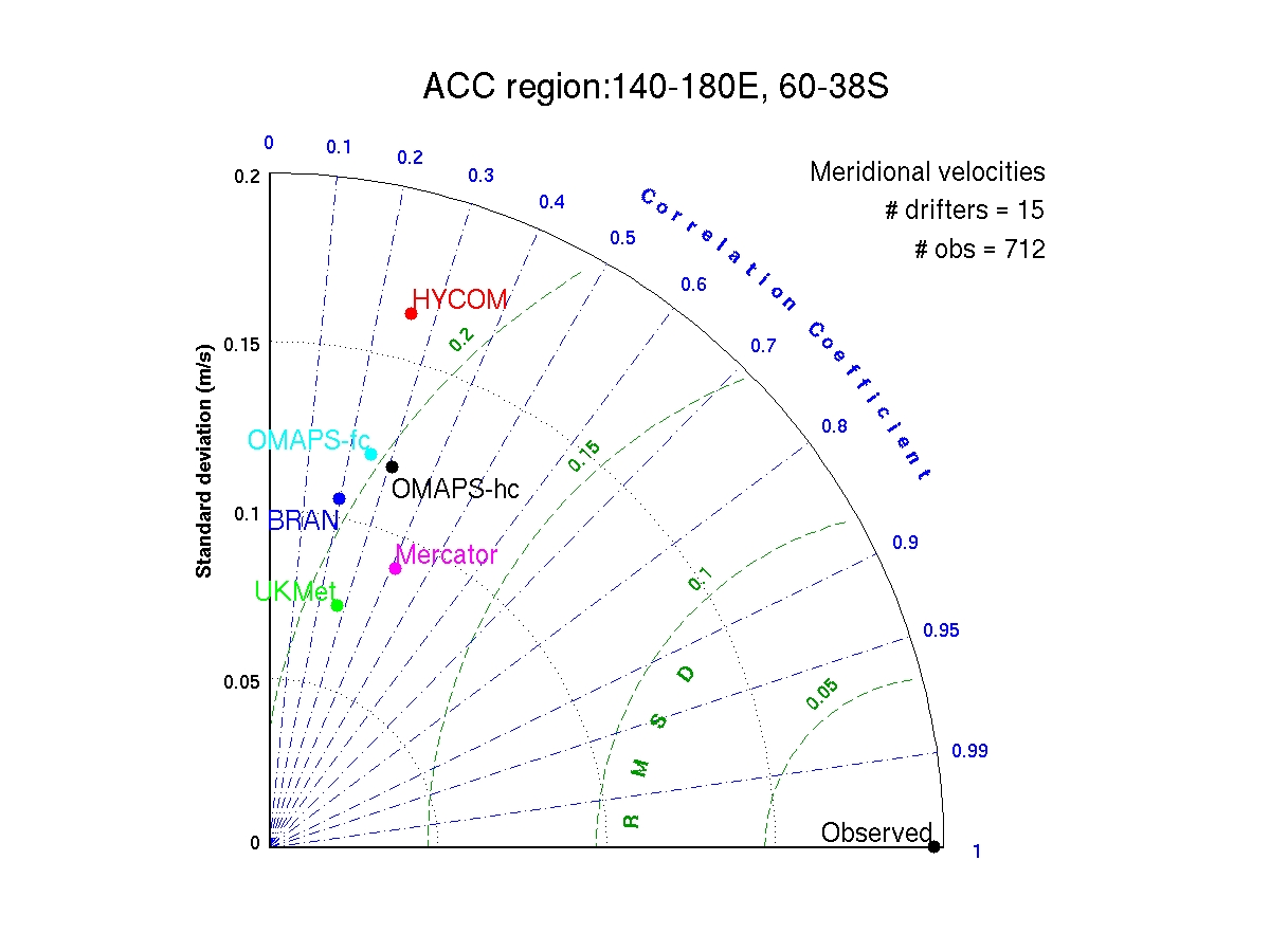
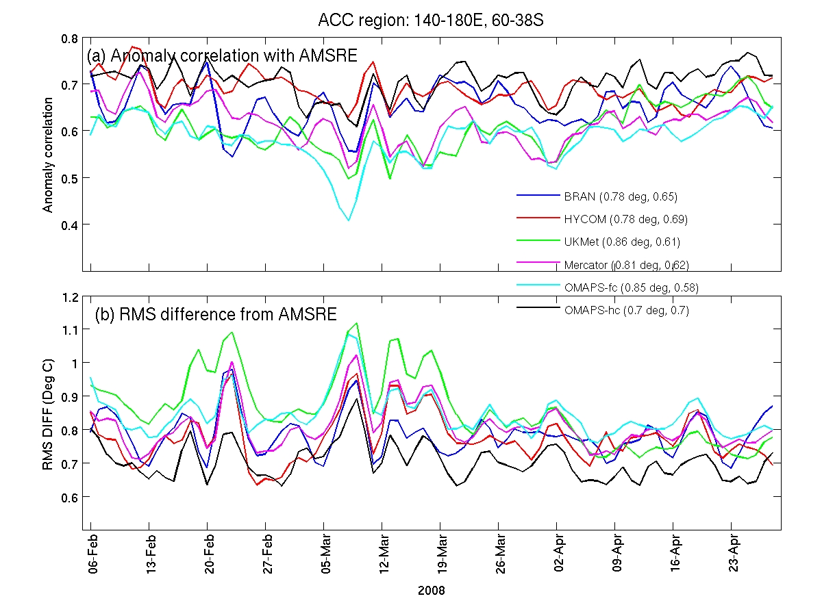
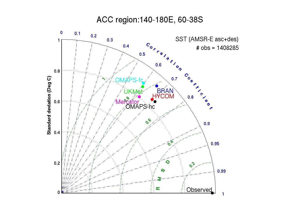
ACC region: as above
Click here for image (~200K)
Time series as
above, except compared to AMSR-E SST observations (both ascending and
descending).
Click here for image (~400K)
Taylor Diagram for
comparison with AMSRE SST
Click here for image (~280K)
|
|
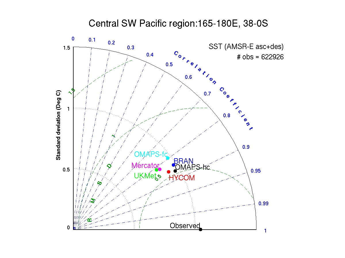
Central-west-south Pacific region: as above
Click here for image (~200K)
Time series as
above, except compared to AMSR-E SST observations (both ascending and
descending).
Click here for image (~400K)
Taylor Diagram for
comparison with AMSRE SST
Click here for image (~280K)
|
SLA
|
EAC Region: Time series of (a) anomaly correlation and (b) RMS difference
between modelled SLA and along-track SLA
(from delayed-mode Jason, Envisat and GFO).
The statistics in
the legend show the time-mean RMS difference and anomaly correlation.
Model sea-surface
height is converted to SLA by removing the
mean sea-level (mean dynamic topography) fields provided by each GODAE
partner.
I spatial average
for the region of interest has also been removed from each model field to
eliminate any mean bias error.
Click here for image (~200K)
Taylor diagram (see Taylor
2001; JGR-Atmos) showing comparisons between
along-track and modelled SLA.
Click here for image (~270K)
|
|
Coral Sea and PNG region: as above
Click here for image (~200K)
Taylor Diagram
Click here for image (~270K)
|
|
ACC region: as above
Click here for image (~200K)
Taylor Diagram
Click here for image (~270K)
|
|
Central-west-south Pacific region: as above
Click here for image (~200K)
Taylor Diagram
Click here for image (~270K)
|
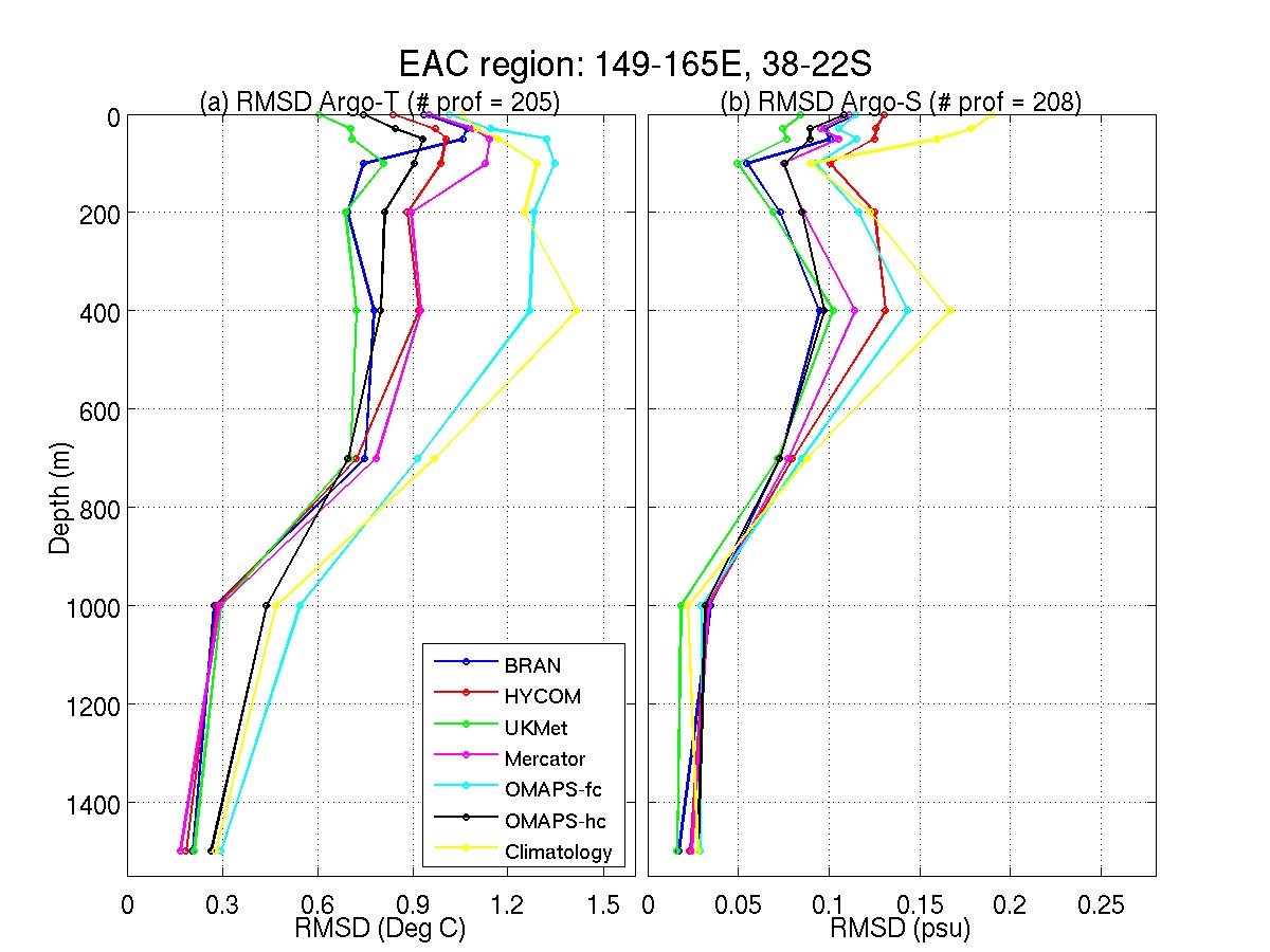
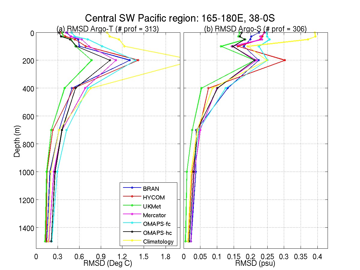
Argo T/S
Qualitative Assessment (in progress)
SST
|
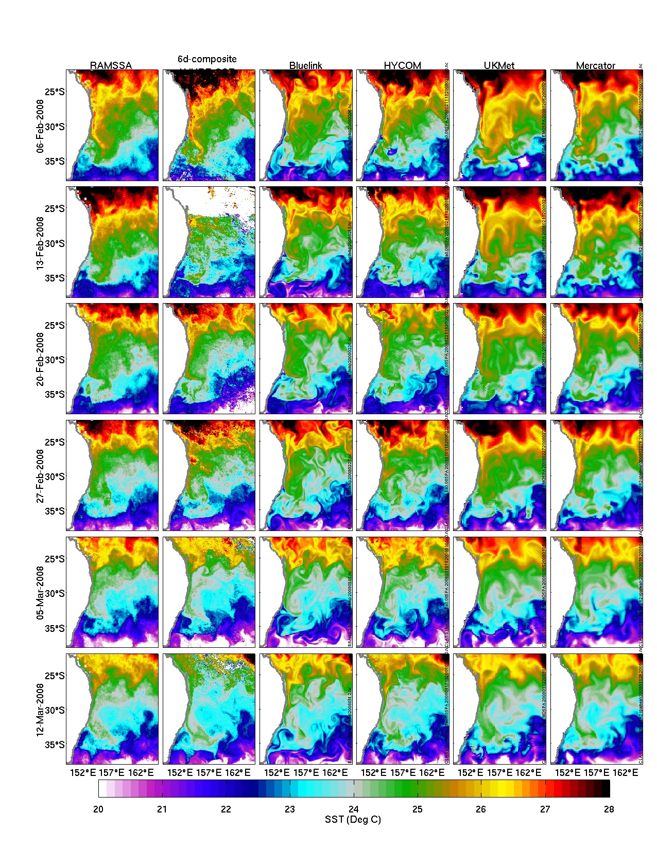
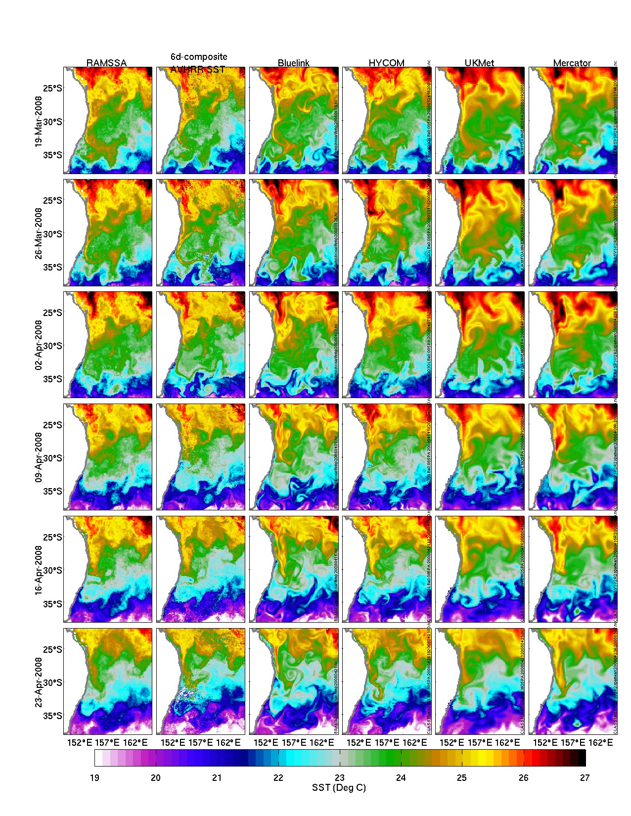
An example of a series of side-by-side
comparisons between modelled SST and observed SST in the EAC region.
Observed
SST is a combination of 3-d averaged AMSR-E and 10-d composite AVHRR SST
processed at CSIRO.
6-Feb-12-Mar
-> Click here for image
(~742KM)
19-Mar-23-Apr
-> Click here for image (~742KM)
|
SLA
|
An example of a series of side-by-side
comparisons between modelled SLA and observed SLA
in the EAC region.
Observed SLA
is a optimal interpolation map of all along-track
altimeter data processed at CSIRO.
Click here for image
(~1.2M)
|
XBT
|
Comparison between the observed and modelled
potential temperature anomaly along the PX6 XBT line.
(a)
Region map showing XBT section.
(b)
Observed section
(c)
Observation-model comparisons at 1 m
depth.
(d)
Observation-model comparisons at 50 m
depth.
(e)
Observation-model comparisons at 200 m
depth.
(f)
Observation-model comparisons at 400 m
depth.
Model fields are plotted for selected depths
that are common to all models.
Click here for image
(~280K)
|
|